

Hey there everyone! This is andi guinness. I hope you’ve been enjoying our releases of late, especially the avalanche of releases last week! We also hope you’ve been enjoying the quality content we’ve been posting of late, as well as look forward to our Feature Artist Week with the talented DB-Spencer!
But I’m not here to talk about either of those. Instead, let’s talk about the future. It’s full of stars, ducks, pizza, and possibly explosions. Maybe pizzasplosions caused by ducks, buuuuut let’s not get ahead of ourselves here. It also contains a new Affect3D, as we announced last year! We’re really excited. Let’s discuss the progress we made on that front.
Looking Back at the Old
So, a little background. The website’s undergone a facelift or two since it started over five years ago. Just to give you an example, here’s what it looked like shortly after we launched:

Remember when Ayako was our mascot girl?
When Affect3D started out, miro envisioned it as a blog/magazine for 3DX. This was long before the idea of us even having a store became a possibility. Over time, we added the Store (initially part of the website itself), our first big production Girlfriends 4 Ever, and many more elements. Eventually, this old design, which got a couple minor upgrades, grew out of style.
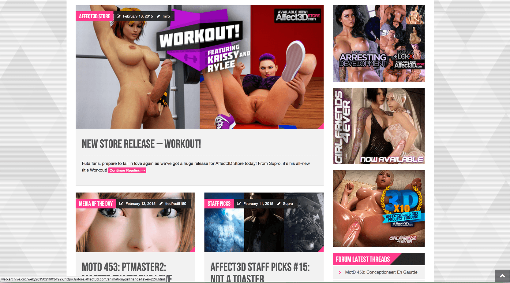
From February 2015. Workouts were few and far between. 😛
The first significant redesign we did was in February 2015, around the time of the first DLC event (which we anticipated to be the only one…and look how that turned out 😛). It mostly maintained the layout of the old design, but added a new aesthetic which gave the site a more exciting feel. We also provided more room to show recent posts. We eventually returned to more modest layout later that year, and it’s mostly been like that since, in spite of host changes and all that fun jazz.
When I started working as Site Editor last year, one of the things I did request we do was focus on creating a new site design outright. While we had another facelift planned among various background projects (the WIP image you saw in my End-of-Year post), I suggested we go bolder than that. While Affect3D has gone from a single artist and animator to a small company with three different branches of operation in five years, the site itself still looks close to what it did in 2011. Much in the spirit of miro’s vibe, I told him we go big or we go home. So we went big.
Previewing A New World of Erotica (Websites)
Development of the new site design began in earnest in December last year, and I’ve been leading it with help from designers and programmers on our team. We discussed different themes and layouts, while making clear the fundamental foundation doesn’t change. After this occurred, we began setting up the layouts in earnest for posts, the homepage, and category pages. In particular, we’ve wanted to make pages such as our 3DX Artist Resource actual go-to sources for information. Our goal was simple: Bring something new to the table that was both inviting and accessible. We certainly made progress on that front.
What I’m about to show you is some previews of the new site. Keep in mind: This is still a work in progress. The layout, and most definitely the color scheme and fonts, need some work done, and the header images don’t match their resolution. But what you’re about to see is quite different from what you’re looking at lately. I think you’ll be impressed.
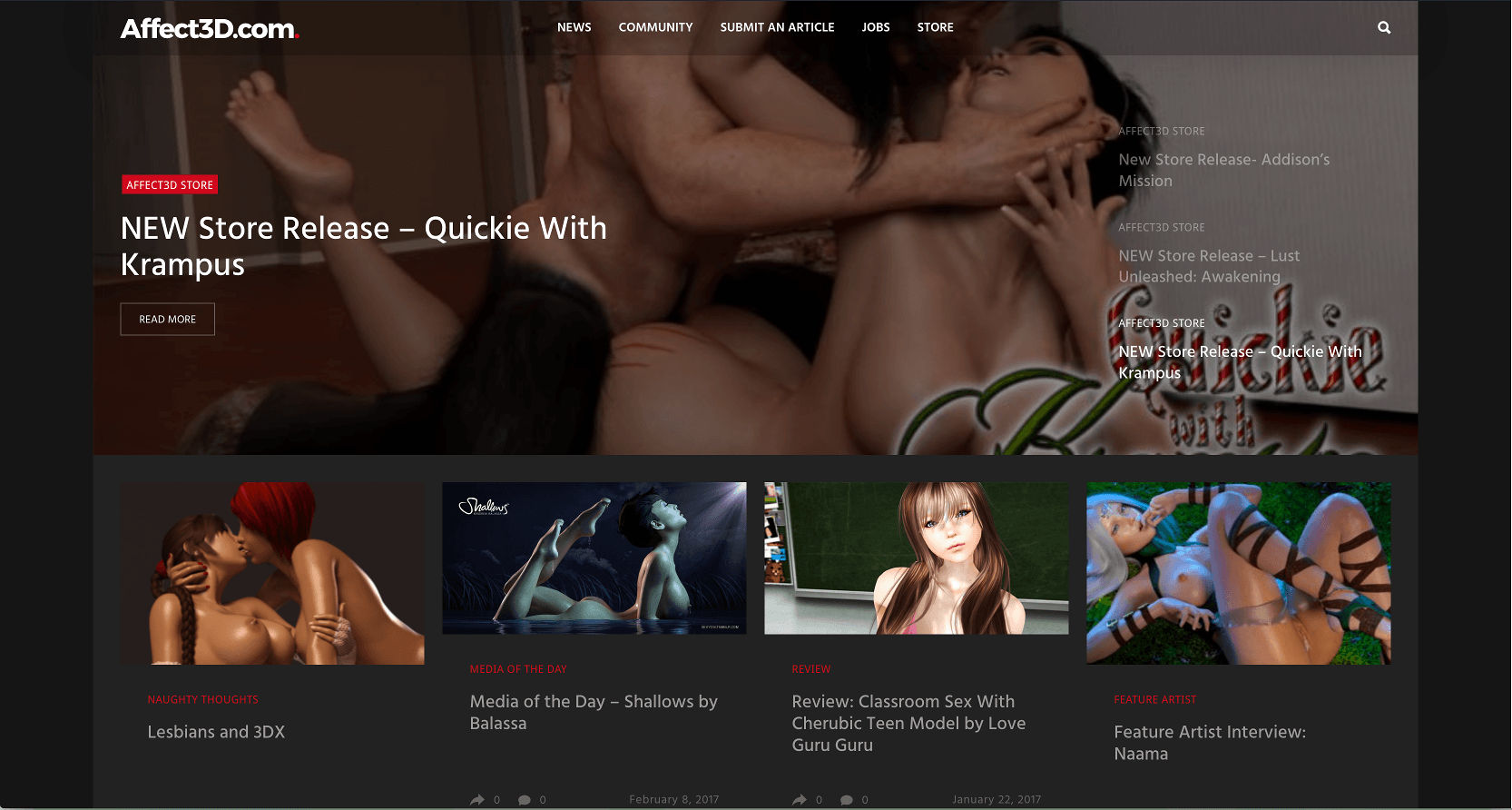
This is the new home page. As you can see, this is a departure from what we’ve had in the past. The difference is obvious from the first thing you see: Our product showcase at top. It’s actually a lot more controllable and less janky than what we’ve been working with in the past. we can even make it full screen for big releases, if we wanted to. The sidebar on the front page is gone, replaced with different layouts for various categories.

We can show off what’s new, but we can also offer more direct access to posts from new releases. Missed an image or video clip from our Media of the Day? Want to know what sexy shenanigans our writers are up to? It’s much easier to find what you’re looking for.
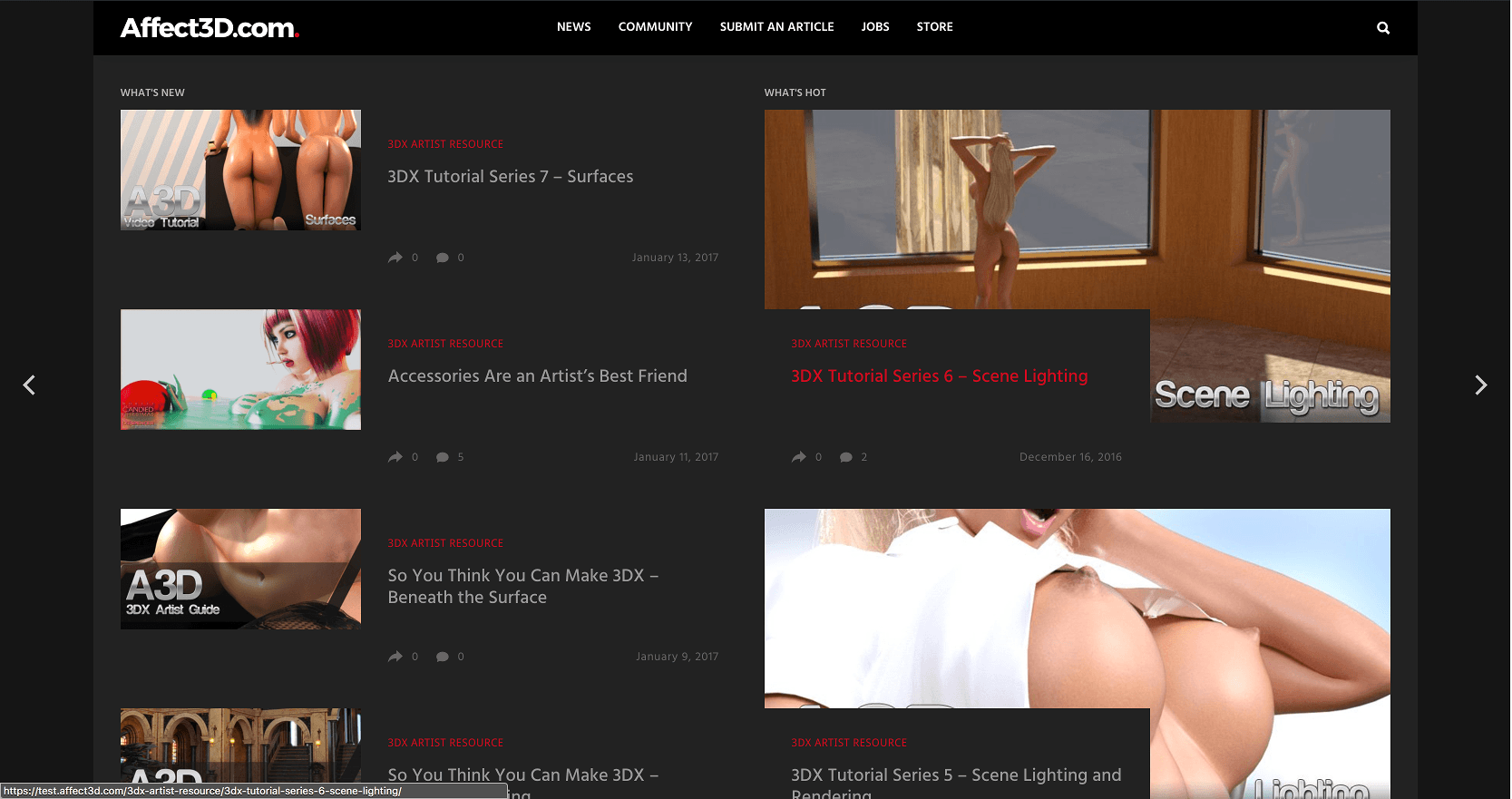
As stated earlier, this is our 3DX Artist Resource page. It’s cleaner, much more organized, and easier to follow. That should be helpful, will it not?
Of course, we have to show off some of the posts in this new layout. The regular posts have a certain amount of sexy to them. The big thing is our big stories though: With full-width imagery, we can play around with certain looks and aesthetics, give readers a greater impression of what’s going on.
The Work Ahead
There’s still a lot of work to be done. Particulars that we’re focusing on:
- Home page needs a finalized layout.
- We need to greatly improve the color scheme, and possibly use a different font.
- Video and Gallery(!) pages need testing and sussing out.
- All the category pages need to be set up.
- We need to create posts using the current set up (including new graphics!) to iron out kinks.
- Fixing bugs.
Still, we made some great progress. So, we appreciate your patience. We also seek your help! We’re looking for more writers to join the staff, as we’ll probably begin expanding our operations with this new design. Any writers, especially female writers, are welcome to apply.
If you want to learn more on how to become an Affect3D Writer, check out the Jobs Page!
It’s likely we’ll have this site ready to go very, very soon. So keep your eyes peeled. And remember: We don’t do these redesigns without a big reason. 😉
Adam Ellis
February 26, 2017Hi Andi, all of these things you are working on look great, the design and functionality of affect3D have always been great and you are right to keep working on improvements as it is always important to stand out from the crowd (the internet is crowded and affect3D does stand out!) I do have some ideas for storylines that should go well with the “New affect3D” theme, Miro was close when he introduced the DLC add-ons to Girlfrieinds4Ever but the room for expansion is much greater. It would be great to go over these ideas sometime, just email me.
Tony Smyth
February 23, 2017As a regular store user I’d like to know if it could be tweaked to show what the logged in user has already purchased. At the very least I’d like to be notified at the checkout that I’ve already purchased a particular product in the past, but it’d be great if the user could see if they’ve purchased a product when on the page for that product.
Is that possible?
miro
February 28, 2017thanks for the input, have added this to our todo list
ammon17
February 21, 2017Lookin` good! Might I suggest for the front page colors, a metallic teal theme? 😉
Of course, the classic Affect3D (Sayako style purple), and the newerish blue and silver layout were both great, but sometimes you just need to cram more `product` into less space, all while maintaining the core emphasis on `big releases`. You know what I mean?
Can’t wait to see what’s coming down the pipelines.
jack pinder
February 21, 2017Yes I do agree. More writers, articles, surveys, a public suggestion page and of course more ballsy women like Marie.